Saturday, February 14, 2009

Webcomic resources from the people who know!

Hey readers,

It's Saturday and I wanted to give you something that you may find valuable. I know some of my audience are webcomic creators/authors and are always searching to better their comic. That is why I write my reviews. However, I'm not writing a review today. Instead, I'm giving those of you looking for innovation some resources that may help you on your exploration. Below are some links and resources that I've found and have helped me intensely. I'm sure that you've already seen some or all of these resources, but take a look at some of the ones you haven't seen because these are top quality! :)

Characters & The Basics:

Tom Dell' Aringa of Marooned has 7 Steps to Writing a Good Webcomic. I've used these steps myself in brainstorming and developing my upcoming webcomic. In his post Tom goes through the 7 steps he uses when working on a new comic. He starts with character development and how important it is to really understand your characters then moves on to the technical part of writing and how to "cut the fat". I really feel that this resource is essential to good writing and the development of a good webcomic. 

Humor:

Recently, I asked some friends at Webcomics.com to give me some feedback
on my blog on how I can offer better reviews to my readers. I was sent over to the Wondermark archives where he had some resources posted on how to write well developed comics. What I found were incredibly well written critiques on some of the most popular Newpaper comics. One article that interested me delved into the humor behind The Wizard of ID. This resource offered invaluable information on comic humor and what is funny and what is not. This is definitely worth reading if you haven't already done so. 

Layout, Bubbles, Design:

This may be a bit frustrating, but it's the truth. The best resource out there on creating your comic's layout, understanding bubbles, and developing your overall design is in How to Make Webcomics. I know that buying a book seems a bit ridiculous when the internet is so much faster and cheaper, but if you really want to comprehend how to format and layout your comic you need to pick this book up. Scott, Brad, Dave, and Kris have really put together a nice resource for comic creators. The book has much more in it than just the few things I mentioned above so I can see how it would be incredibly helpful for those searching to better their comic, or those in the development stage. It's a must-have for any comic creator.
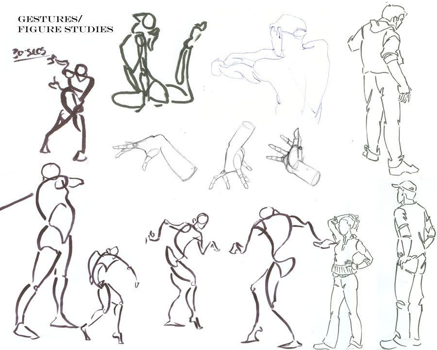
Artwork:

I can't tell you what "good" artwork is because frankly, there is no definition. What some people enjoy others may not. There's a lot of reasons why that is, but most of those reasons fall under the Psychological realm, and that's not what I write about in this blog. Instead of a definition for what good webcomic artwork is I'm going to give you a link to a discussion about artwork that took place in ZWOL. The original blog post asks a question that facilitates a great discussion on comic art. I suggest you take a look. 

Another forum post that was facilitated by me can be found HERE at Webcomicsinc.com. Some fellow webcomic artists posted their thoughts on what good art in webcomics is. This post is definitely worth checking out!

Also, Wikipedia gives a basic rundown of some of the styles that are prevalent in webcomics. You might want to read their article under the "Medium" heading.
These resources have helped me tremendously from guiding me on my writing to how I want my artwork to look. These resources come from other webcomic authors/artists just like you, but they've had some success. So they're words of wisdom have come from experience in the business. So I hope they can help you if you need it. :) If you need any other help on developing your webcomic that isn't within the topics covered above feel free to e-mail me! I'm always glad to help. 

Thanks again,

Josh Engle


Wednesday, February 11, 2009

Dilbert gets kicked in the face by Office Space!

Hey readers,

This Thursday I have a webcomic that combines the workplace dynamic of Dilbert and cynicism of Office Space.

Introduction:

Penned In was created in September of last year by artists/writers Discipulo and M. Garcia. This fresh webcomedy examines the tedious workday of two characters, Ace and Guy, every Tuesday and Thursday. These two computer geeks are completely dysfunctional and because of that dynamic it makes the reading of this comedy a riot!

Writing:

Overall I am impressed with the comedic style of this comic. Discipulo and Garcia have created a love child between Dilbert and Peter Gibbons.

Let's examine what makes this comic so funny. First, the characters themselves are extremely well developed. Guy is the normal underachiever that has the ability to do more with his life, but chooses not to. Ace is the overweight lazy co-worker that just doesn't give a damn, but somehow still has a job. You can explicity see how the comic displays their character traits in the strip Meet Ace shown below.

Take an intense look at this strip. What can you tell from the characters? What personality traits do you see? Can you see laziness, sarcasm, and overall lethargy? You can see that both characters are lazy from the second frame, but in the third you find the sarcasm that radiates from this comic.

Other things that cultivate the style of humor present in this comic are the punchlines and subject matter. Discipulo and Garcia have got a fair grasp on delivering material to their audience that packs a punch. In the strip Hit That! we get to see their craft at one of its funniest moments so far. By using our perception of the situation to mislead us they've set us up for a humorous ending. These two writers have a gift for the short comedy strip. They vary their comedic approach and by doing so create a unique atmosphere that is never stagnant.

The subjects in their comic vary as well. They combine office humor with geeky references and create a concoction worth devouring. In the below strip entitled Fett up you can see a bit of what I'm talking about.

If you weren't a Sci-Fi/Star Wars geek you wouldn't understand this joke at all! Luckily we are geeks and can find this comedy as gleeful as it was meant to be. By combining this genre of humor with an Office Space attitude Discipulo and Garcia have created a sub-genre that takes a spin off of Dilbert's everyday office happenings and spices it up with some nerdy interludes.

I do want to point out one writing change that this comic has currently undertaken. The most current strips have torn away the iconic Comic Bubble that is so familiar to all comic lovers and have started writing the dialogue in the background of each frame. They need to be careful with this move from traditional dialogue. The bubbles have a purpose to serve. They keep the writing short and sweet. Without them the dialogue can get drawn out and weaken the punchline of a joke. For example, look at this recent post below.

Do you see how the extremely long monologue Ace expunges in the second frame tears a little away from the overall humor of the joke? Now, taking away the bubbles doesn't mean that a joke won't be funny in a comic strip. However, bubbles do make sure that the dialogue stays short and to the point by taking up more space in the frame. That way the humor of a strip doesn't get lost in too much dialogue.

Artwork:

As you can see the artwork of this comic isn't the greatest or most streamlined. However, it isn't that bad, especially for a comic just starting out. I want you to notice the backgrounds in each frame of the strip that's below this paragraph. It lacks a setting, but has these odd shapes that float behind each character. Notice how these shapes change according to the moods and situations that the characters are in.
This use of shape changes really helps set the entire mood of each strip and further boosts the atmosphere of each scene. Using the background in a strip can help your strip set the mood like Discipulo and Garcia have done here.

What you also might want to notice in the above strip is the use of motion in the second frame. Instead of just showing the man dying with his hand in the air, they've added a tiny bit of detail that adds vitality to their artwork.

One thing that these artists may need to work on is appendage drawing. While browsing through their archive I came across a few strips where Ace's and Guy's hands and bodies looked a little awkward. Look at Sweet Suspense in the second frame. Ace's hands are meant to be clasped in excitement but it looks as though they couldn't quite pull it off. It looks more like his hands are becoming fused together like two gelatins coming together. That's just one example of this drawing issue, but it appears in a few other strips throughout the archive.

Conclusion:

With their sub-genre defining humor and dynamic use of artwork this webcomic is extremely uproarious! :) I genuinely enjoyed going through the archive of this comic. I've bookmarked it and am going to keep checking up on this every Tuesday and Thursday when they post their new strip.

Their site is easy to navigate and the archive is simple and easy-to-use. They post podcasts every now and then, but I didn't have the time to listen to any. If you're interested check out the site and listen to a few and post some comments of your opinions. They've also got some wallpapers and links that are amusing.

My overall appraisal of Penned In is an 85 out of 100. I will definitely be checking out this comic in the next few months for a laugh and to check up on its progress. I suggest you do the same!

Thanks again,

Josh Engle