Hey readers,
So I'm deeply sorry I haven't posted this week. The main reason for the lack of literature is due to my working on something extra special for you. ;) I've been writing a couple of webcomic artists and authors for some feedback on a subject that I think you'll find very interesting. I'll be posting their thoughts this Monday the 2nd of March. So be sure to check back for that extra special post!
Thanks again,
Josh Engle
Thursday, February 26, 2009
Monday, February 16, 2009
The Tale of the Holy Duct Tape?!......

Hey readers,
As you may have noticed, most of my posts are reviews over comedic webcomic strips. The main reason behind this is that I love comedy strips. Their short-but-sweet punchlines put a smile on my face and keep me from slamming my face into my keyboard while at work. Today, however, I'm bringing you a webcomic that's from a different genre. This webcomic resembles a more traditional print-page comic style and artwork. It's called Ned the Chainsaw Guy. It's a bit graphic so if you're under the age of 14 I would advise getting some form of permission from SOMEONE before you check it out. ;)
Introduction:
Oren Kramek, Omer Goodovich, and Marcia Patricio are the writers/authors of Ned the Chainsaw Guy. It revolves around two main characters: Ned and Toadie. Ned is the badass with a sense of humor that only talks when the opportunity presents itself as funny or needed. He wields a giant sword with chainsaw-razored edges. Toadie is, of course, the silly sidekick that keeps the humor flowing. This dynamic of badass and baboon has been done and repeated thousands of times and is in no way original, but it does make for a great story doesn't it? This comic isn't very old, but the story and artwork is so well done that it makes it seem as though it's been around for years.

Artwork:
The most impressive piece of this comic is by far the artwork. The smoothness of colors and textures combines in this comic to make beautiful digital pages. To the left you can see one of the strips from the archive that exemplifies the hard work and skill that goes into making the artwork for this comic. Notice their use of color and texture around the shrubbery.When you look closely you see just a jumble of colors, but by adding the dark spots and highlighting bits and pieces of the tops of the trees you get the feel of being in a lustrous forest. Their style in this artwork is stunning. You can really see that these artists have a gift for coloring and details.
Take a look at this STRIP. Notice the use of color here to emphasize the characters. Toadie is beautiful and full of color while the bartender and Ned are somewhat grayed. Toadie's character is the one being emphasized because of his drunkeness and conversation. He is the most interesting character in this strip and the authors use the artwork to reflect the dialogue. By dulling out the other characters the reader focuses more on the colorful one. This shows a great eye for imagery and story telling. Great job!
One thing I want to point out in this artwork is that while this comic is generally stimulating and gorgeous there are times when my eyes get overstimulated by the use of colors and detail. Of course colors and detail are an essential and vital part of comics and usually the more the better. However, knowing how to use the color is just as important as using it. Look at this STRIP. Kramek and Goodovich's eye for detail is shown brilliantly in this page, but doesn't it seem a bit confusing in the battle scene among the shrooms? It's hard to tell what exactly is going on. I can tell Ned had jumped from the aircraft into the midst of what appears to be humanoids and shrooms, but other than that I can't exactly tell what he's doing or what the humanoids exactly are. This hasn't happened much in this comic, but I've noticed my eye squinting a few times to figure out what was happening in a few frames. A bit of dulling the background used here, like what was used above, would go a long way.
Writing:
Not only is the artwork amazing in this comic, but the story is as well. Kramek and Goodovich really have an understanding for what makes a story intense and interesting. In fact, their storytelling style reminds me of the mid-90's cartoons that used to dominate my Saturday mornings. When you read this comic you get the feeling that you're watching a very consuming animated film. I don't want to give you a synopsis because I really feel like you should check it out yourself.

The comic's characterization is very well done. Each character has a distinct personality and is very consistent throughout. Within the first 3 or 4 strips you look at you get a grasp of who each character is. Look at the strip to the right. From this page you can tell that Toadie, the minotaur, is a bit of a self-confident loud-mouth that's not afraid to puncture an ego. Also, from this page you get the feeling that Ned is the boss-man. He's sitting back with his feet on the table simply stamping each page while everyone else is doing the work. You definitely get a sense of his badass-ness from looking at this. This display of characterization is refreshing! It's very seldom that I come across a comic as well developed as this. Of course we haven't seen much of the back story of each character, but I have a feeling each has their own unique and well plotted history.
One, very small, flaw I found when looking through the archives is the spelling. Every now and then I found a single word that was mispelled. Nothing too major, but definitely something worth squashing. :)
Conclusion:
With its amazing artwork and brilliant storytelling I will definitely be adding this to my bookmarks. This print-page comic style is perfect for the story and helps add some WOW factor into my emotions. If this comic were posted consistently on time I would give it a somewhat higher score, but Ned the Chainsaw Guy is getting a 90 out of 100! This is the best score so far for any comic that has been reviewed on The Tattler. Great job Marcia, Oren, and Omer! Keep up the good work and I will definitely be keeping up with your story!

Thanks again,
Josh Engle
Saturday, February 14, 2009
Webcomic resources from the people who know!
Hey readers,
It's Saturday and I wanted to give you something that you may find valuable. I know some of my audience are webcomic creators/authors and are always searching to better their comic. That is why I write my reviews. However, I'm not writing a review today. Instead, I'm giving those of you looking for innovation some resources that may help you on your exploration. Below are some links and resources that I've found and have helped me intensely. I'm sure that you've already seen some or all of these resources, but take a look at some of the ones you haven't seen because these are top quality! :)


 These resources have helped me tremendously from guiding me on my writing to how I want my artwork to look. These resources come from other webcomic authors/artists just like you, but they've had some success. So they're words of wisdom have come from experience in the business. So I hope they can help you if you need it. :) If you need any other help on developing your webcomic that isn't within the topics covered above feel free to e-mail me! I'm always glad to help.
It's Saturday and I wanted to give you something that you may find valuable. I know some of my audience are webcomic creators/authors and are always searching to better their comic. That is why I write my reviews. However, I'm not writing a review today. Instead, I'm giving those of you looking for innovation some resources that may help you on your exploration. Below are some links and resources that I've found and have helped me intensely. I'm sure that you've already seen some or all of these resources, but take a look at some of the ones you haven't seen because these are top quality! :)
Characters & The Basics:
Tom Dell' Aringa of Marooned has 7 Steps to Writing a Good Webcomic. I've used these steps myself in brainstorming and developing my upcoming webcomic. In his post Tom goes through the 7 steps he uses when working on a new comic. He starts with character development and how important it is to really understand your characters then moves on to the technical part of writing and how to "cut the fat". I really feel that this resource is essential to good writing and the development of a good webcomic.
Humor:
Recently, I asked some friends at Webcomics.com to give me some feedback
on my blog on how I can offer better reviews to my readers. I was sent over to the Wondermark archives where he had some resources posted on how to write well developed comics. What I found were incredibly well written critiques on some of the most popular Newpaper comics. One article that interested me delved into the humor behind The Wizard of ID. This resource offered invaluable information on comic humor and what is funny and what is not. This is definitely worth reading if you haven't already done so.
Layout, Bubbles, Design:
This may be a bit frustrating, but it's the truth. The best resource out there on creating your comic's layout, understanding bubbles, and developing your overall design is in How to Make Webcomics. I know that buying a book seems a bit ridiculous when the internet is so much faster and cheaper, but if you really want to comprehend how to format and layout your comic you need to pick this book up. Scott, Brad, Dave, and Kris have really put together a nice resource for comic creators. The book has much more in it than just the few things I mentioned above so I can see how it would be incredibly helpful for those searching to better their comic, or those in the development stage. It's a must-have for any comic creator.
Artwork:
I can't tell you what "good" artwork is because frankly, there is no definition. What some people enjoy others may not. There's a lot of reasons why that is, but most of those reasons fall under the Psychological realm, and that's not what I write about in this blog. Instead of a definition for what good webcomic artwork is I'm going to give you a link to a discussion about artwork that took place in ZWOL. The original blog post asks a question that facilitates a great discussion on comic art. I suggest you take a look.
Another forum post that was facilitated by me can be found HERE at Webcomicsinc.com. Some fellow webcomic artists posted their thoughts on what good art in webcomics is. This post is definitely worth checking out!
Also, Wikipedia gives a basic rundown of some of the styles that are prevalent in webcomics. You might want to read their article under the "Medium" heading.
These resources have helped me tremendously from guiding me on my writing to how I want my artwork to look. These resources come from other webcomic authors/artists just like you, but they've had some success. So they're words of wisdom have come from experience in the business. So I hope they can help you if you need it. :) If you need any other help on developing your webcomic that isn't within the topics covered above feel free to e-mail me! I'm always glad to help. Thanks again,
Josh Engle
Wednesday, February 11, 2009
Dilbert gets kicked in the face by Office Space!
Hey readers,
 Penned In was created in September of last year by artists/writers Discipulo and M. Garcia. This fresh webcomedy examines the tedious workday of two characters, Ace and Guy, every Tuesday and Thursday. These two computer geeks are completely dysfunctional and because of that dynamic it makes the reading of this comedy a riot!


 This use of shape changes really helps set the entire mood of each strip and further boosts the atmosphere of each scene. Using the background in a strip can help your strip set the mood like Discipulo and Garcia have done here.
This Thursday I have a webcomic that combines the workplace dynamic of Dilbert and cynicism of Office Space.
Introduction:
Penned In was created in September of last year by artists/writers Discipulo and M. Garcia. This fresh webcomedy examines the tedious workday of two characters, Ace and Guy, every Tuesday and Thursday. These two computer geeks are completely dysfunctional and because of that dynamic it makes the reading of this comedy a riot! Writing:
Overall I am impressed with the comedic style of this comic. Discipulo and Garcia have created a love child between Dilbert and Peter Gibbons.
Let's examine what makes this comic so funny. First, the characters themselves are extremely well developed. Guy is the normal underachiever that has the ability to do more with his life, but chooses not to. Ace is the overweight lazy co-worker that just doesn't give a damn, but somehow still has a job. You can explicity see how the comic displays their character traits in the strip Meet Ace shown below.
Take an intense look at this strip. What can you tell from the characters? What personality traits do you see? Can you see laziness, sarcasm, and overall lethargy? You can see that both characters are lazy from the second frame, but in the third you find the sarcasm that radiates from this comic.
Other things that cultivate the style of humor present in this comic are the punchlines and subject matter. Discipulo and Garcia have got a fair grasp on delivering material to their audience that packs a punch. In the strip Hit That! we get to see their craft at one of its funniest moments so far. By using our perception of the situation to mislead us they've set us up for a humorous ending. These two writers have a gift for the short comedy strip. They vary their comedic approach and by doing so create a unique atmosphere that is never stagnant.
The subjects in their comic vary as well. They combine office humor with geeky references and create a concoction worth devouring. In the below strip entitled Fett up you can see a bit of what I'm talking about.
If you weren't a Sci-Fi/Star Wars geek you wouldn't understand this joke at all! Luckily we are geeks and can find this comedy as gleeful as it was meant to be. By combining this genre of humor with an Office Space attitude Discipulo and Garcia have created a sub-genre that takes a spin off of Dilbert's everyday office happenings and spices it up with some nerdy interludes.
I do want to point out one writing change that this comic has currently undertaken. The most current strips have torn away the iconic Comic Bubble that is so familiar to all comic lovers and have started writing the dialogue in the background of each frame. They need to be careful with this move from traditional dialogue. The bubbles have a purpose to serve. They keep the writing short and sweet. Without them the dialogue can get drawn out and weaken the punchline of a joke. For example, look at this recent post below.
Do you see how the extremely long monologue Ace expunges in the second frame tears a little away from the overall humor of the joke? Now, taking away the bubbles doesn't mean that a joke won't be funny in a comic strip. However, bubbles do make sure that the dialogue stays short and to the point by taking up more space in the frame. That way the humor of a strip doesn't get lost in too much dialogue.
Artwork:
As you can see the artwork of this comic isn't the greatest or most streamlined. However, it isn't that bad, especially for a comic just starting out. I want you to notice the backgrounds in each frame of the strip that's below this paragraph. It lacks a setting, but has these odd shapes that float behind each character. Notice how these shapes change according to the moods and situations that the characters are in.
This use of shape changes really helps set the entire mood of each strip and further boosts the atmosphere of each scene. Using the background in a strip can help your strip set the mood like Discipulo and Garcia have done here.What you also might want to notice in the above strip is the use of motion in the second frame. Instead of just showing the man dying with his hand in the air, they've added a tiny bit of detail that adds vitality to their artwork.
One thing that these artists may need to work on is appendage drawing. While browsing through their archive I came across a few strips where Ace's and Guy's hands and bodies looked a little awkward. Look at Sweet Suspense in the second frame. Ace's hands are meant to be clasped in excitement but it looks as though they couldn't quite pull it off. It looks more like his hands are becoming fused together like two gelatins coming together. That's just one example of this drawing issue, but it appears in a few other strips throughout the archive.
Conclusion:
With their sub-genre defining humor and dynamic use of artwork this webcomic is extremely uproarious! :) I genuinely enjoyed going through the archive of this comic. I've bookmarked it and am going to keep checking up on this every Tuesday and Thursday when they post their new strip.
Their site is easy to navigate and the archive is simple and easy-to-use. They post podcasts every now and then, but I didn't have the time to listen to any. If you're interested check out the site and listen to a few and post some comments of your opinions. They've also got some wallpapers and links that are amusing.
My overall appraisal of Penned In is an 85 out of 100. I will definitely be checking out this comic in the next few months for a laugh and to check up on its progress. I suggest you do the same!
Thanks again,
Josh Engle
Sunday, February 8, 2009
Ahhhhh! Real Monsters!
Hey readers,
 It's monday and that means that you receive a NEW REVIEW. The process of reviewing is time consuming if you strive to write honestly and expressly. Recently I requested fellow reviewers to gander at my writings from the past few weeks and offer some feedback. One responder who calls himself Phool wrote and offered premium criticism and because of Phool's response I've doubled the amount of time I take to write reviews! This means that you get better critiques and I work harder to give it to you! So I really hope you enjoy my work as I contend to improve it. :)
Introduction:
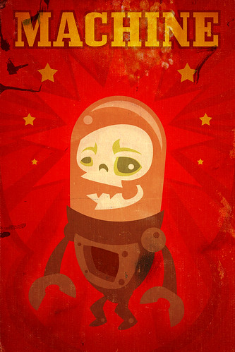
Today's review is over Monster Commute, which is what Daniel Davis, the creator/author of this comic describes as "a free webcomic about the endless daily commute of a robot and a beast, stuck on a monster highway." Monster Commute is a 5 day a week comic based around two characters: Chadworth Machine, and Beastio. Since the title of this comic blatantly describes the story I won't go into details describing it. Instead, I'll jump directly into the critique.
Artwork:
I've been told that it's nice to start a review with some positive feedback so I'm going to follow that advice. The artwork that Daniel Davis conceives is highly original and terribly cheerful. With no black lines to outline his characters he creates a world that is skillfully original. I'm hard-pressed to think of other webcomics that utilize the same technique. Daniel creates an environment within his comic that is all-his-own by separating the look and feel of his comic from all the others that are striving toward notoriety. What's more, Daniel's use of color and eye for detail gives pieces of his artwork vitality. Look at You Wound Me. It's a perfect example of Daniel's gift for giving accessory to his work. The car in the top frame of the art has tiny pieces of detail, like the tiny license plate and the scratch on the rear fender, that adds character to the day's comic. By using detail you develop more than just a better piece of art. By adding detail you further develop the scene/atmosphere and ensnare your audience with visual stimulation.
Daniel's artwork is highly original, but his use of repeating graphics becomes irritating. More than 100 comic posts are under his belt for Monster Commute, and I would estimate that more than half of those are nearly identical! Not only are most of the page layouts monotonous, but the character poses are as well. What was gained by adding detail to each comic is crushed by the size 15 shoe that his graphic-repetitiveness wears. Below are some examples of what I mean.
See how each layout along with each character is nearly %100 identical! He changes the colors of the backgrounds as if to say to his audience "hey guys I'm changing things. See how this page is different from every other page because the inside of the car is a different color?" Instead, what they're hearing is "I'm being lazy and I hope you don't notice." Of course they do notice and I'm sure a lot of people that skim through his archives do also. Daniel, spice up your layout. Add some variety to the perspective or change the order of the frames. Do anything to make me feel like I'm not as bored as your characters while they're on their long commute to work.
Writing:
The idea of a webcomic based around commuting to work sounds intensely boring. However, everyday mundane tasks can sometimes be spiced up with out-of-the-ordinary modifications. Now, writing about monsters on their way to work in a world where goblins and Frankenstein make guest appearances, that sounds more like a plot that would create an enticing story line. It sounds like it, but it's not. There seems to be a lack of climax with every situation that Monster and Beastio find themselves in.
Character development is possibly the most important factor in a webcomic. It allows the writer to explore new avenues of the story and also helps create the story. Daniel doesn't seem to be attempting to add depth to his characters. He puts them in situations that are perfect for elaborating on who they are, but fails to do so. Click (here) and you can see a recent comic where Beastio and Chadworth are pulled over by a giant Crow robot policeman for sleeping at the wheel. However, instead of capitalizing on the funny predicament that these two characters are in Daniel has them talking about traffic laws. How are we gaining any insight into who these characters are if they aren't saying anything interesting about themselves?
Character development helps keep readers interested. It's about longevity. Also, how are we supposed to remain interested in a comic that's supposed to be funny but isn't? We can't. The image below is a perfect example of the lacking punchlines that plague Monster Commute.
It's monday and that means that you receive a NEW REVIEW. The process of reviewing is time consuming if you strive to write honestly and expressly. Recently I requested fellow reviewers to gander at my writings from the past few weeks and offer some feedback. One responder who calls himself Phool wrote and offered premium criticism and because of Phool's response I've doubled the amount of time I take to write reviews! This means that you get better critiques and I work harder to give it to you! So I really hope you enjoy my work as I contend to improve it. :)Introduction:
Today's review is over Monster Commute, which is what Daniel Davis, the creator/author of this comic describes as "a free webcomic about the endless daily commute of a robot and a beast, stuck on a monster highway." Monster Commute is a 5 day a week comic based around two characters: Chadworth Machine, and Beastio. Since the title of this comic blatantly describes the story I won't go into details describing it. Instead, I'll jump directly into the critique.
Artwork:
I've been told that it's nice to start a review with some positive feedback so I'm going to follow that advice. The artwork that Daniel Davis conceives is highly original and terribly cheerful. With no black lines to outline his characters he creates a world that is skillfully original. I'm hard-pressed to think of other webcomics that utilize the same technique. Daniel creates an environment within his comic that is all-his-own by separating the look and feel of his comic from all the others that are striving toward notoriety. What's more, Daniel's use of color and eye for detail gives pieces of his artwork vitality. Look at You Wound Me. It's a perfect example of Daniel's gift for giving accessory to his work. The car in the top frame of the art has tiny pieces of detail, like the tiny license plate and the scratch on the rear fender, that adds character to the day's comic. By using detail you develop more than just a better piece of art. By adding detail you further develop the scene/atmosphere and ensnare your audience with visual stimulation.
Daniel's artwork is highly original, but his use of repeating graphics becomes irritating. More than 100 comic posts are under his belt for Monster Commute, and I would estimate that more than half of those are nearly identical! Not only are most of the page layouts monotonous, but the character poses are as well. What was gained by adding detail to each comic is crushed by the size 15 shoe that his graphic-repetitiveness wears. Below are some examples of what I mean.
 |  |
 |  |
Writing:
The idea of a webcomic based around commuting to work sounds intensely boring. However, everyday mundane tasks can sometimes be spiced up with out-of-the-ordinary modifications. Now, writing about monsters on their way to work in a world where goblins and Frankenstein make guest appearances, that sounds more like a plot that would create an enticing story line. It sounds like it, but it's not. There seems to be a lack of climax with every situation that Monster and Beastio find themselves in.
Character development is possibly the most important factor in a webcomic. It allows the writer to explore new avenues of the story and also helps create the story. Daniel doesn't seem to be attempting to add depth to his characters. He puts them in situations that are perfect for elaborating on who they are, but fails to do so. Click (here) and you can see a recent comic where Beastio and Chadworth are pulled over by a giant Crow robot policeman for sleeping at the wheel. However, instead of capitalizing on the funny predicament that these two characters are in Daniel has them talking about traffic laws. How are we gaining any insight into who these characters are if they aren't saying anything interesting about themselves?
Character development helps keep readers interested. It's about longevity. Also, how are we supposed to remain interested in a comic that's supposed to be funny but isn't? We can't. The image below is a perfect example of the lacking punchlines that plague Monster Commute.
 So they're monsters, right? Monsters talking about a corpse they just ran over should be a situation that exudes comedy, right? Wrong. Daniel fails miserably at his attempt to make his audience chuckle. Sure, it's a little funny that these two monsters just ran over a corpse. But, just saying what happened isn't good enough to get people to laugh. There has to be some depth to the dialogue in order for the reader to say, "Oh I get it. That's clever" and hopefully it's clever enough and packs enough punch to make that person laugh. Here's an example of using the situation Daniel created, but it uses dialogue that could get some laughs, or is at least interesting.
Beastio: I hate speedbumps. Speaking of hate what's with that girl you went out with last week?
Chadworth: What?! Amy's great and she's hot!
Beastio: Really? Because the last time I saw her she looked dead. Her face looked mangled and it looked like she had gravel in her teeth.
Chadworth: What!? No way! When did YOU see her?
Beastio: About five minutes ago.... when you ran her over with the car. I hate speedbumps.....
Of course, Daniel doesn't have to get so graphic with his jokes, but you can see how using the same situation and playing with the dialogue can add to the characters, help develop the story, and make your readers laugh. From this little piece of dialogue readers can gather that Beastio has a sick sense of humor, Chadworth is single and looking, and Beastio is a little bit of a male chauvinist. Even if your characters aren't any of these things you can still understand that dialogue is an extremely important piece of your comic. Its what directly connects your readers to your characters. So half-assing your writing and punchlines is a definite no no!
Conclusion:
Daniel gets close to creating comedic dialogue with these strips: Goth Inside, The Dread, and Furnace Goblins. However, while reading his other strips I felt like a kid on Chistmas opening up all my shiny presents only to find that the shiny wrapping paper WAS my presents. I felt like this because his webcomic looks pretty but lacks the most important part. If he can grasp that savoriness he's portaying in the few strips mentioned above and elaborate on them then Daniel's audience might be more inclined to come back for more because they enjoy the story as well as the artwork. I give Monster Commute a 60 out of 100 because of the severe lack of humor and character development. The good news is that these are the only things lacking from this comic. Daniel has done a great job perfecting his style (minus the repitive graphics). So keep up the good work Daniel and please try to get some depth to your comedy and characters.
Thanks again,
Josh Engle
Wednesday, February 4, 2009
Women Wrestling... 'Nough said!
Hey readers,
So today I'm posting a review of a very attractive webcomic. Rival Angels combines one of America's most guilty pleasures and one of its most blatant! ;) Wrestling and Women. Alan Evans, the webcomic author has created a webcomic with a small but strong web following. Why does this comic have such a strong fan base you might ask? Let's see.

That good enough for you boys? These wrestling girls are hot and they kick ass! But that's not all webcomics are about right? Right. There has to be a story and I'm happy to say that this comic actually has one. Now, I'm not a fan of wrestling but I've watched a few matches when I was a kid with my grandpa, who was infatuated with the "sport". So I know a little about it, although it doesn't particularly intrigue me Alan's story was flowing and stimulating , but this webcomic is not exactly the most pristine out there. The artwork is okay, but not great and the dialogue is lacking. At times, mostly when the angels are "girl-talking", the conversation drags and gets to be somewhat arid and forced. This comic is also without humor. Alan makes attempts at jokes, but falls short. I browsed through his comic for over an hour and never laughed............ Not even once, but I guess that's not what Alan is going for. Although, laughter can be a pretty useful tool. I think if Alan threw in some funny quips into the mix every now and then the dialogue might not be so static.
The biggest plus about this comic though, is something that many comic creators fail to do. Alan listens to his fans. The sex appeal in this comic is non-existent which at first I couldn't understand.
 However, once I started to slice through the surface and read the forum posts and comments I found an incredible fan base that was extremely vocal. The fans don't want sex. They want wrestling! The forum was filled with posts about who they wanted to battle next, and character fan clubs. These fans are die hards. So do you put explicitly sexual artwork in your comic or do you keep the story the way the fans want it? I know, tough call, but I think Alan made the right choice by sticking to the story and not alienating his fans. By doing so he has created a mini-culture of fans devoted to a serious story about female wrestlers.
 The rest of the webcomic is okay. Alan provides a forum as I mentioned above which provides a cultivation utensil for his fans. His website layout is okay, but not anything special and the site graphics are mundane. He could stand to spice up his site a bit with some cohesive graphic art and design that pulls together and further cultivates what he is emphasizing: a place where his fans can share with each other...... Okay I feel like I'm being a little harsh. I'm very critical of site graphics and design, and I forget that webcomics take years to develop. I also forget that site cohesiveness is one of the hardest things for comic artists to achieve. So don't take my site critiques too harshly Alan, but when you get the chance try and tackle that website of yours. Ok?
My overall Appraisal of Rival Angels: 75
(score from 0-100)
Monday, February 2, 2009
Some dialogue for thought.
Hey readers,
So it's monday morning and I'm supposed to be writing a new review today. However, I just posted the review for Crooked Gremlins on Saturday and during that process I had an interesting conversation with Carter Fort, co-creator of Crooked Gremlins. Our conversation was mainly about webcomic sites and their utility. I posted the main subject of each message below. I think you'll find the conversation interesting.
 [me]
[me]I was searching through endless networks of comics when I came across yours'. I fell in love and had to write a review about Crooked Gremlins.

[Carter Fort]
Thanks for the kind words. I can't tell you how much we appreciate them. It's a nice change from, "I don't get it," or "Why would the Gremlin have a gun?" or "What's with all the penis jokes?"
Knowing that someone, somewhere, is chortling because of us is all we need. Well, that and fat stacks of fan-boy cash, but we're willing to wait on that one.
You mentioned something about being confused by the layout of the site. Can you be more specific? I haven't had any complaints yet. I mean, the meat of the site is the comic - and that's easy to navigate through via the buttons beneath it, no?
[me]Here are some things that I found that either confused me or didn't like about it. First, your sidebar has a lot of information in it. (the one on the right) After scrolling to read your blog it gets monotonous after a few seconds because all the colors and formatting is the same. At a glance I couldn't tell where the "sites we likes" ends and the comments begin. I think it's because you have no defined graphical separators for each gadget in your sidebar. If you had colored footers or gadget backgrounds for each it might help better separate each gadget and give your readers a break from the black and whiteness of your page. :) The same thing can go for your posts. There's a lot of white space on your page, which isn't always a bad thing. But in your case the white space is a little cumbersome. A website is all about what's easy to see. Readers don't like to feel like they're searching for information. So by breaking up information, graphically, it helps make the reading process easier. You can do that with black and white or by introducing other colors into your site.
So it isn't necessarily your layout as much as the formatting of your site. I hope you find this helpful because I did enjoy your comic. I might even mail you later on for some tips when I get my comic up and going. :)
[Carter Fort]
I agree with you about the right column. My list of things to do has "get appropriate iconography for right column" and maybe add some kind of wrapper for the comments. It's certainly missing something, I just haven't figured out what yet. I know that too many graphics on the site will distract from the comic, which is not what's gonna be happenin'.
[me]
The ice is starting to melt outside, and I cannot waste this day in front of my wonderful machinery. I must venture out into the world.
[me]I agree with you that too much graphics is BAD GRAPHICS! :) I'm sure you'll think of a way to make the site graphically pleasing while emphasizing the comic strip. I think adding a little color to differentiate your layout wouldn't be a bad thing if you utilize the colors in a way that they say "background" to your audience instead of "hey look at me i'm a bunch of colors that are distracting". :) Also, you might want to think about simplifying what is contained in your sidebar. Finding an effective way to say everything you want to say without overcluttering your homepage can be a hard task. I'm still struggling with that right now. But when it comes to sidebars the rule of thumb is, less is more. I hope I've been of some use to you and have helped in some way. I also wish you guys the best of luck. I hope enjoy your ice-melting day! :D
What to take away from this conversation:
1: Your website is extremely important! It needs to be an extension of your comic.
2: Don't clutter your web space with frivolous extras that derail your readers from the true purpose their visiting your site; your comic!
3: Try to shy away from using distracting colors or graphics. They also tear your readers away from your comic.
4: Try to separate the sections of your site. You don't want readers to be confused while reading your blog posts when their eyes keep drifting over to other sections of your page.
I hope you enjoyed this conversation and learned something from it.
Thanks again,
Josh Engle
Saturday, January 31, 2009
Crooked Gremlins? Are there straight gremlins too?
Hello readers,


Carter Fort and Paul Lucci are the creators of this merry little comic. Fort and Lucci's story revolves around 4 gremlins that are carrying on the traditions of their forefathers to make life for humans hell! The story ends there however because there is no ongoing story with these four creatures. Each potential story line ends after two or three strips only. Fort and Lucci don't make an effort to have a developing story or thickening plot, but this doesn't seem to be hurting the comic. In fact, the lack of development in the story seems to work for it rather than against it because their impulsive humor and impulsive story lines are very cohesive. We'll see if this strategy continues to work for them.
So I did some searching over the past few days to find a webcomic that I didn't previously know. I wanted to find a unique and comical medium that I could enjoy writing a review/critique on for today's blog. What I found was a gem! Crooked Gremlins is a webcomic for gamers, pop-culture enthusiasts, and lovers of political satyre. :) Let's anatomize this comic a bit to see what's goin' on from the inside.
Carter Fort and Paul Lucci are the creators of this merry little comic. Fort and Lucci's story revolves around 4 gremlins that are carrying on the traditions of their forefathers to make life for humans hell! The story ends there however because there is no ongoing story with these four creatures. Each potential story line ends after two or three strips only. Fort and Lucci don't make an effort to have a developing story or thickening plot, but this doesn't seem to be hurting the comic. In fact, the lack of development in the story seems to work for it rather than against it because their impulsive humor and impulsive story lines are very cohesive. We'll see if this strategy continues to work for them.
This creative team hasn't developed much of a story yet, but they have developed a very delectable humor. Their mix of crudeness and teenage-boy behavior made me chortle (odd word so i had to use it! ) quite a few times while intensely drifting through their strips. Much of their humor comes from their love of video games, but they also use graceless means to create laughable situations. Imagine 4 mischievous teenage brothers for a night on the town and you can get the feel of this comic strip. Perhaps a combination that could possibly help exemplify the dynamic of this group of gremlins would be between The Ninja Turtles and Chris Farley and David Spade. Weird I know, but it works.
Fort and Lucci have created a uniquely delectable piece of artwork that had me laughing on every strip. I predict this newly founded webcomic to be on its way to becoming a well-liked and admired strip for a large fan base. One note that I wanted to append on this review was about the user interface and the design of their website. Their site is not very pleasing to the eye. :( Their choice of color scheme and overall layout/format of their site is very displeasing and a little confusing. However, with some tiny adjustments and more time I'm sure Crooked Gremlins' site will be just dandy.
My overall appraisal of Crooked Gremlins: 80
(Score from 0-100)
Thanks again,
Josh Engle
P.S.
If anyone has a webcomic that they're wanting to be reviewed/critqued/dismantled just let me know by e-mail webcomictattler@gmail.com or by leaving comments here on the blog. Also, if any of you have any ideas for the blog of how to make it better or bigger feel free to use that e-mail and comment too! :)
Monday, January 26, 2009
The Pixelton Fairy!
Hey guys,
So I've been following Welcome to Pixelton for awhile now and this sarcastic medium has extravagantly changed over the past few months. Josh Farkas, the creator and artist of WP has been a little occupied. Let's take a critical look at what batty innovations he's been putting this webcomic through and why.

So I've been following Welcome to Pixelton for awhile now and this sarcastic medium has extravagantly changed over the past few months. Josh Farkas, the creator and artist of WP has been a little occupied. Let's take a critical look at what batty innovations he's been putting this webcomic through and why.
The first and most noticeable change WP has transitioned through is quantifying the art. Mr. Farkas has joined the ranks of the numerous comic owners and started giving pieces to fans 4 times per month as opposed to his normal once a month. As a reader I appreciate the added sarcasm in my personality diet, but has this weakened the strength of the comic? In my opinion it has. My explanation for this logic follows.
The second change Josh has put WP through is changing the once ultra-colorfied artwork into simple black and white strips for the sake of posting his art 1-week. This style works for many comics. On the other hand, I felt like the biggest strength WP had was its artwork. Josh worked very hard on his strips and it showed. I would enjoy just looking at his art almost as much as the story he was sharing which leads me to my next point. My opinion has always been that the art is half the story in the webcomic world so by taking away the vitality of his artwork Josh has sliced the life of his story in half!
Now, if you have been a fan of Josh's work with Welcome to Pixelton as long as I have you can almost excuse this drastic transtition because he has been busy working on something far more important! His Welcome to Pixelton Graphic Novel has been his baby for a year now. He has been working diligently to bring his fans something we can hold and enjoy, but he needs to be careful because many of his fans, including myself, are expecting the same style of artwork he was displaying during his first year of posting on Welcome to Pixelton. If he fails to deliver I predict he'll lose a large portion of his fan base because fans don't like to be disappointed.
With all that said I do wish Josh the best of luck and hope he continues making this comic because it really is one of the best out there. I'll be hoping for more than luck however, because I do keep wanting him to return to his original style of colorful pages and complicated storyline.
My overall Appraisal of Welcome to Pixelton: 85
(Score from 0-100)
Thanks again,
Josh Engle
Thursday, January 22, 2009
The Beginning of a TattleTale
I want to begin my blogging endeavors by explaining exactly what I'm doing. In short I am writing a tattletale. I enjoy belly flopping into the different worlds that webcomic artists create and therefore, I naturally want to thrust down your throats my biased and highly underrated opinions about these different worlds. Webcomics like Welcome to Pixelton, The Noob, and xkcd.com are widely known to the webcomic connoisseur, but most of these patrons of the digital pages don't venture beyond the digital ink and ask the important questions like:
Why is this comic funny?
Why is it relevant?
Why do I keep coming back to this comic?
Why is this sewage-of-a-webomic so popular and making so much money?
All of these are important questions that need to be answered because without understanding these questions then we're really just cyber drifters looking for instant gratification. Which is okay by me, but when you revisit their pages of fun for new and inspiring art or satyre you begin to drift away from instant gratification and metamorphose into what the industry likes to call "a fan". When that transformation happens you will no longer simply amble by these webcomics. Instead, you will want to know the answers to these questions.
Thus is the importance of my righteous critiques on this fantasy world of stick figures and colorful MMORPG characters. So please enjoy my slights and flatteries as they will be offered multiple times a week !
Thanks
Josh Engle
Subscribe to:
Posts (Atom)


